Editor templates introduction
We offer you some Templates you can use and customize quite easily already, however, sometimes you just want or need your very own template and this is where this document comes in. Here, we will show how you can make your very own template. Which is basicly just placing some HTML comments in your source code.
This guide is for the new Cleverreach editor released in 2021.
Before you start
While a email is is just HTML, it’s not as easy as creating a single HTML website since most email clients out there tend to display emails differently. So, Before you start modifying your template, make sure it already works on all the major email clients out there, especially on all the Outlook versions.
Example
Lets start with this basic example. Lets just imagine this is our template and we want to make it as hassle free to edit for the user as possible.
<html>
<body bgcolor="#ffffff">
    <h1>Daily Newsletter</h1>
    <p>Your daily update for all that is happening with XXXXX</p>
    <table >
        <tr><td>
            <div>
                <h3>did this just happen?</h3>
                <img src="https://cloud-files.crsend.com/img/16_9_600.png" width="320" height="190" />
                <p>You wouldn't believe what just happened. If you want to know more, click the link down below!</p>
                <a href="http://www.example.com">Read more</a>
            </div>
            <div>
                <h3>Wait, this happened too??</h3>
                <img src="https://cloud-files.crsend.com/img/16_9_600.png" width="320" height="190" />
                <p>Maybe not as awesome as the previous news, but still very very interesting.</p>
                <a href="http://www.example.com">Read more</a>
            </div>
        </td></tr>
    </table>
</body>
</html>
Taking a look at the code, its pretty much just text, images and links we want to be editable.
We generally treat text and links as simple HTML which leaves us with these 2 mayor types we can insert: HTML and IMAGE
- To make text editable, we simply wrap it in
<!--#html#--><!--#/html#--> - To make images editable, we wrap them with
<!--#image#--><!--#/image#-->
This is what the template will look like.
<html>
<body bgcolor="#ffffff">
    <h1><!--#html#-->Daily Newsletter<!--#/html#--></h1>
    <p><!--#html#-->Your daily update for all that is happening with ACME<!--#/html#--></p>
    <table >
        <tr><td>
            <div>
                <h3><!--#html#-->did this just happen?<!--#/html#--></h3>
                <!--#image#-->
                    <img src="https://cloud-files.crsend.com/img/16_9_600.png" width="320" height="190" /><!--#/image#-->
                <p><!--#html#-->You wouldn't believe what just happened. If you want to know more, click the link down below!<!--#/html#--></p>
                <!--#html#--><a href="http://www.example.com">Read more</a><!--#/html#-->
            </div>
            <div>
                <h3><!--#html#--><!--#/html#-->Wait, this happened too??</h3>
                <!--#image#--><img src="https://cloud-files.crsend.com/img/16_9_600.png" width="320" height="190" /><!--#/image#-->
                <p><!--#html#-->Maybe not as awesome as the previous news, but still very very interesting.<!--#/html#--></p>
                <!--#html#--><a href="http://www.example.com">Read more</a><!--#/html#-->
            </div>
        </td></tr>
    </table>
</body>
</html>
You could now load this template into the editor and simply click the the text or image areas to edit them.
Tip: You can use the source code editor during the creation process and simply switch back and forth between the editors (top right) to check your results.
Dropable areas
The previous method is great if you don’t want your user to have to much influence, but its usually more common to have specific areas where the user can just drop predesigned HTML bits, which include different forms of layouts.
We call those area’s loop and they represent
those dynamic areas. Each block of content in there is wrapped by
<!--#loopitem#--><!--#/loopitem#--> to keep
these elements apart.
If we take a look at our previous example again, we can see we have 2 DIV’s in there which each represent one content block. Lets add our loop tag and drop one of the content block since they are fairly similar anyway.
<html>
<body bgcolor="#ffffff">
    <h1><!--#html#-->Daily Newsletter<!--#/html#--></h1>
    <p><!--#html#-->Your daily update for all that is happening with ACME<!--#/html#--></p>
    <table >
        <tr><td>
        <!--#loop#-->
            <!--#loopitem#-->
                <div>
                    <h3><!--#html#-->did this just happen?<!--#/html#--></h3>
                    <!--#image#--><img src="https://cloud-files.crsend.com/img/16_9_600.png" width="320" height="190" /><!--#/image#-->
                    <p><!--#html#-->You wouldn't believe what just happened. If you want to know more, click the link down below!<!--#/html#--></p>
                    <!--#html#--><a href="http://www.example.com">Read more</a><!--#/html#-->
                </div>
            <!--#/loopitem#-->
        <!--#/loop#-->
        </td></tr>
    </table>
</body>
</html>Note: loops can not be placed
between <table><tr> or similar structures.
——————————
Template Tag’s
This is a list of all available template tags we use to make templates editable. We split them in 3 categories:
- Content related basic editing
- Helper tags offers buttons, spacers etc
- Design related help you to style your template
Content related
These tags give you basic editing capabilities.
HTML
The HTML tag can handle a variety of HTML related things. From simple text up to complex content, it has multiple switches to control each HTML tag individually.
<!--#html mode="default" inline="true"#--><!--#/html#-->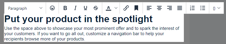
mode will set different type content control options
- default: basic text formatting, links and placeholders
- full: like default but with images
- textonly: will only show placeholders in the toolbar
- link: just shows link settings and placeholders
- safelink: No toolbar, can’t remove links, but has sidebar instead
inline=“true” makes item inline and not a block (only inside the editor). this juts fixes visual errors in the editor and wont affect the actual output
replace=“true” will mark all then text if it’s selected for the first time so replacing it, is easier
IMAGE
This is used to make images editable but also to make them browsersafe. Positioning images in emails is not as easy as you might think, therefore the Editor tries to wrap the image inside a table to it can properly align the image. If your image is already wrapped by a table, place the image tag outside of the table and NOT around the image. If you don’t want your image to be wrapped, you can use the “nowrap” option.
<!--#image align="center" #--><!--#/image#-->align=“center|left|right” This will set the default orientation of the image. if non is set, it will try to figure it out.
margin=“10px 20px” sets the images outer margin value (default “0px”)
nowrap=“true” Image will not be wrapped in table thus no alignment is possible
noresize=“true|fasle” Removes resize ability
forcepx=“true” Percentage based images will be converted to px. this generally works best with all email clients.
replace=“true” Opens filebrowser once the image is clicked. One time thing only and used to replace placeholder images.
inline=“true” Makes image (in editor) inline and not a block. this just fixes visual errors in the editor and wont affect the actual output
LOOP / LOOPITEMS
Loop’s create a designated area where the user can drop in new
elements from the sidebar. Loops can not be placed
between table elements like <table><tr> or
<ol><li>
<!--#loop#-->
    <!--#loopitem#-->...<!--#/loopitem#-->
<!--#/loop#-->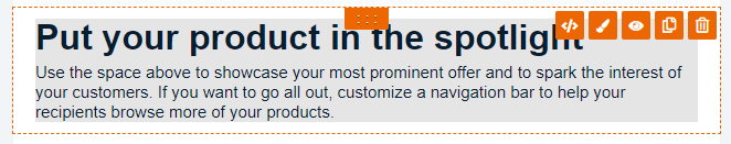
loopitem name: if set, makes it an droppable item in the sidebar
loopitem sidebaronly: will only include it in the sidebar but not in the actual content (dafault:false)
loopitem collapsible: will make the buttons collapsible (dafault:false)
STACKS / STACK-ENTRY
Stacks work like Loops but are very limited in their usage. The idea is to give the user a place where he can only and arrange simple elements (HTML, IMAGE, BUTTON, BUTTON, SPACER and DIVIDER). This can be used toe make columns editable without braking the actual columns.
<table>
    <tr>
        <td>
            <!--#stacks#-->
                <!--#stack-entry#--><p>A</p><!--#/stack-entry#-->
                <!--#stack-entry#--><p>B</p><!--#/stack-entry#-->
            <!--#/stacks#-->
        </td>
        <td>
            <!--#stacks#--><!--#/stacks#-->
        </td>
    </tr>
</table>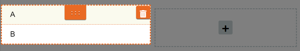
Helper tags
These tags are mainly predesigned elements ranging from simple spacers up to complex elements
BUTTON
This will create a client safe HTML button. None of the values are actually required.
<!--#button bgcolor="#ff6633" color="#000000" align="center" text="Read more" #--><!--#/button#-->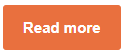
text=“Click here!” Default display text
href=“http://example.url”
bgcolor=“#ff6633” Sets the background color
color=“#ffffff” Defines the font color
align=“center|left|right|block” changes the alignment. Block equals full width
margin=“10px 10xp 20px 20px” outer margin
SPACER
Generates an editable spacer.
<!--#spacer size="50px"#--><!--#/spacer#-->size=“20px” sets default height 20px
DIVIDER
Generates an divider line spacer (like <hr>)
<!--#divider padding="40px" width="85%" align="center" height="2px" color="#888888" bgcolor="transparent"#--><!--#/divider#-->
padding=“20px” sets default height og this element (not the line itself)
width=“20px” The width of the actual line
height=“20px” the height of the actual line
bgcolor=“#ffffff”
color=“#ffffff”
align=“left|center|right|block”
UNSUBSCRIBE
Gives the user an option to choose from predefined unsubscribe
messages.
Note: Needs to be prefilled with text
<!--#unsubscribe#-->Please <a href="{UNSUBSCRIBE}">unsubscribe</a> me!<!--#/unsubscribe#-->
ABOUTUS
This will add a section where the user can choose from predefined imprints.
Note: This content will be overwritten as soon as you load the template into the editor. If you do not want that, use HTML instead.
<!--#aboutus#--><!--#/aboutus#-->
ONLINEVERSION
Another section for displaying a text and link to the online version
(browser).
Note: Needs to be prefilled with text
<!--#onlineversion#-->If this message is not displayed properly, <a href="{ONLINE_VERSION}">click here</a> please.<!--#/onlineversion#-->
CSS and Design
These settings focus on design and CSS to give the user more and completely custom styling options.
THEMES
This searches for
<style data="cr/theme"></style> and then offers
a Theming tab under the side “Design” tab. All classes defined here will
also be appended inline to ensure maximum compatibility.
It works basicly like SASS but will only replace variables.
note: Everything below “*/” will be replaced as its going to be the rendered css output.
<style data="cr/theme">
/*
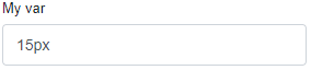
$my_var: 15px;
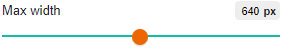
$slider-Max_width: 600px;
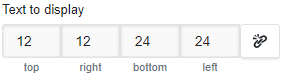
$quad-Text_to_display: 12px 12px 24px 24px;
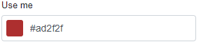
$color-use_me: #ffffff;
$image-Background_image: https://example.com/batman.png;
.mytest {
width: $my_var;
margin: $quad-Text_to_display;
background-color: $color-use_me
}
.background {url($image-Background_image);}
*/
...
</style>We offer a set of Presets and prefixes which will help you controlling the type of inputfield.
$slider-uses a slider instead of an input
$quad-displays quad input field (f.e. for margins and paddings)
$color-will result in a color picker
$image-returns an image selector

$my_varresults in an input field which is labledMy var. The “_” is generaly replaced with ” ” (space)
Custom Editor settings
This controls the Editor itself and gives you the option to show,
hide and force some settings onto the user.
Note: This is best placed in the first line, but will
work everywhere else as well.
<!--#template css="false" settings="false" #-->css=“false” Hides the “Design” tab in the main sidebar
settings=“false” Hides the “Settings” tab in sidebar
default-elements=” false” Hides all elements in sidebar
advanced-elements=” false” Hides all advanced in sidebar
user-elements=“false” Hides all user elements in sidebar
agency-elements=“false” Hides all agency elements in sidebar
custom-elements=“false” Hides all elements except template in sidebar
css-to-inline=“true|false” Forces CSS/styles to inline mode
version=“2.0” Disable old template fallback functions (for example automatic editing of class “body”, “.a”, “.text”)
hideplugins=“edithtml,conditional” tries to hide specific plugins. this is not supported by all plugins
fix-top=“true” adds extra space on the top (only in editor) to fix missing HTML toolbar
image-nowrap=“true” disables Table wrapping of images
image-nohref=“true” disables link settings for all images
loops-collapsible=“true” makes all buttons in loopitems collapsible
Editable CSS / Style
With this you can have editable CSS blocks in the design tab, so users can change their template up to their likening.
Simply place /* @title Display Name */ above a CSS
class, and it (and all its values) becomes available under the “Design”
tab.
<style>
    /*  @title Display Name */
    .exampleclass {
    background-color: #080708 !important;
    color: #ffeeff;
    padding: 5px;
    margin: 10px 5px;
}
</style>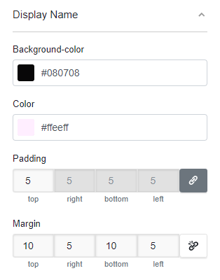
Furthermore, you can merge multiple CSS definitions into one group by
adding @group mygroupname to the comment
<style>
    /*  @title margins and paddings
        @group My custom group
    */
    .exampleclass1 {
    padding: 5px;
    margin: 10px 5px;
    }

    /*  @title mostly colors
        @group My custom group
    */
    .exampleclass2 {
    background-color: #080708 !important;
    color: #ffeeff;
}

</style>
.editable
If you add class editable to any of your HTML elements
inside a <!--#loop#--><!--#/loop#-->, all of
its styles become exposed for editing. 
By default these will be named “Element #” where # is a number based
on the amount of editables you have. You can change that name by adding
data-name to the HTML tag as well.
Optional: You can use data-limit-to
will only make the listed css styles (comma separated) editable and
leave the rest untouched.
Optional: You can use data-style to
make additional styles available to the user, without actually writing
these values into style until they differ from the original
value. Here, it would only be written if background-color
was something else then inherit.
<td style="padding: 10px 20px;text-direction:ltr;" data-style="background-color:inherit;" data-limit-to="padding,background-color" class="editable" data-name="Container">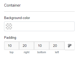
Depcrecated Tags
The Following Tags are deprecated and will be automatically converted into their newer counterpart.
<!--#link#--><!--#/link#-->becomes<!--#html mode="link"#--><!--#/html#--><!--#html_line#--><!--#/html_line#-->becomes<!--#html inline="true"#--><!--#/html#--><!--#text_line#--><!--#/text_line#-->becomes<!--#html inline="true" mode="textonly"#--><!--#/html#--><!--#text#--><!--#/text#-->becomes<!--#html mode="textonly"#--><!--#/html#--><!--#loopsplit#-->becomes<!--#loopitem#--><!--#/loopitem#-->